ART DIRECTION ⇄ DESIGN


JÄGERMEISTER
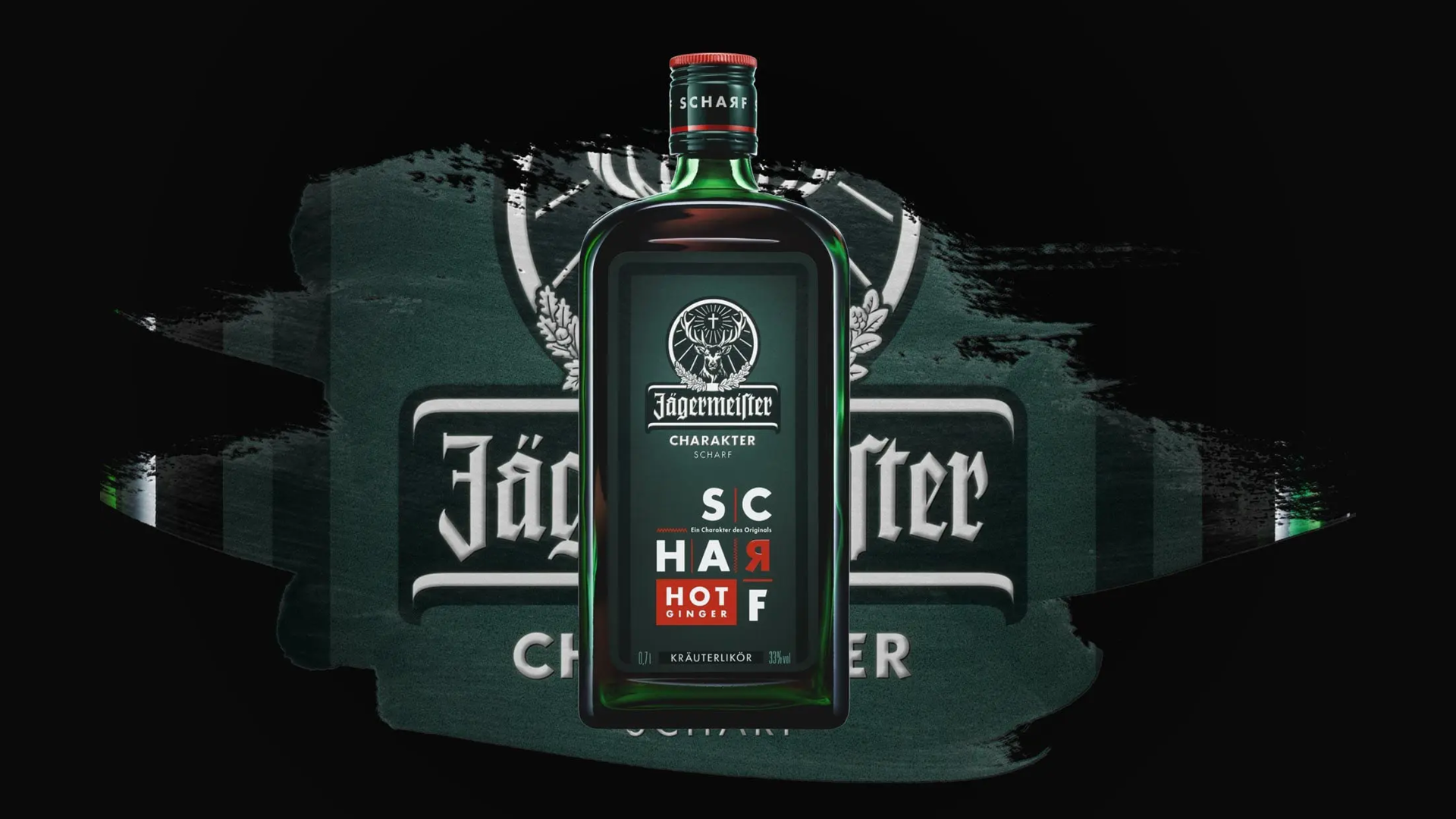
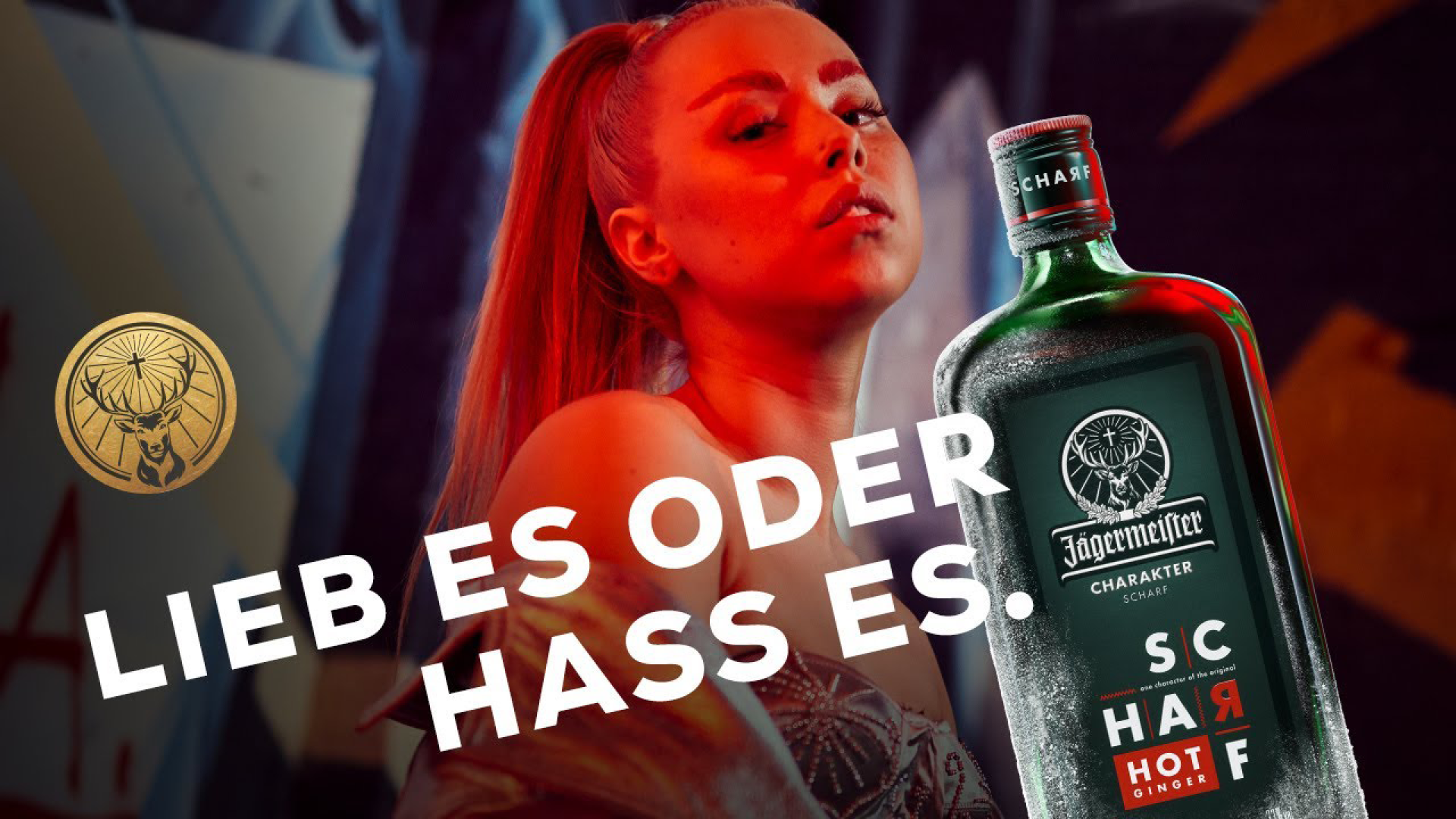
CHARAKTER SCHARF
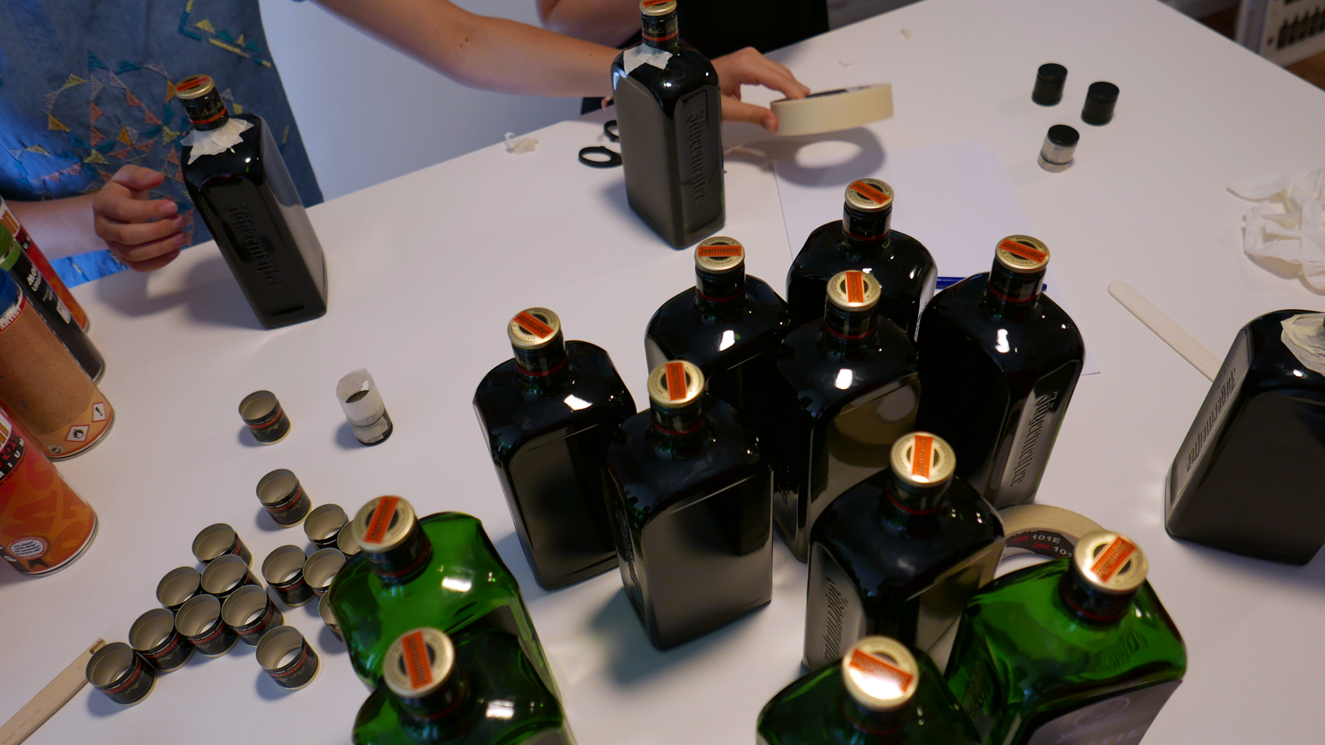
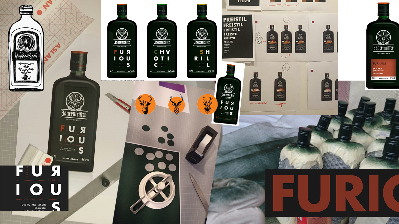
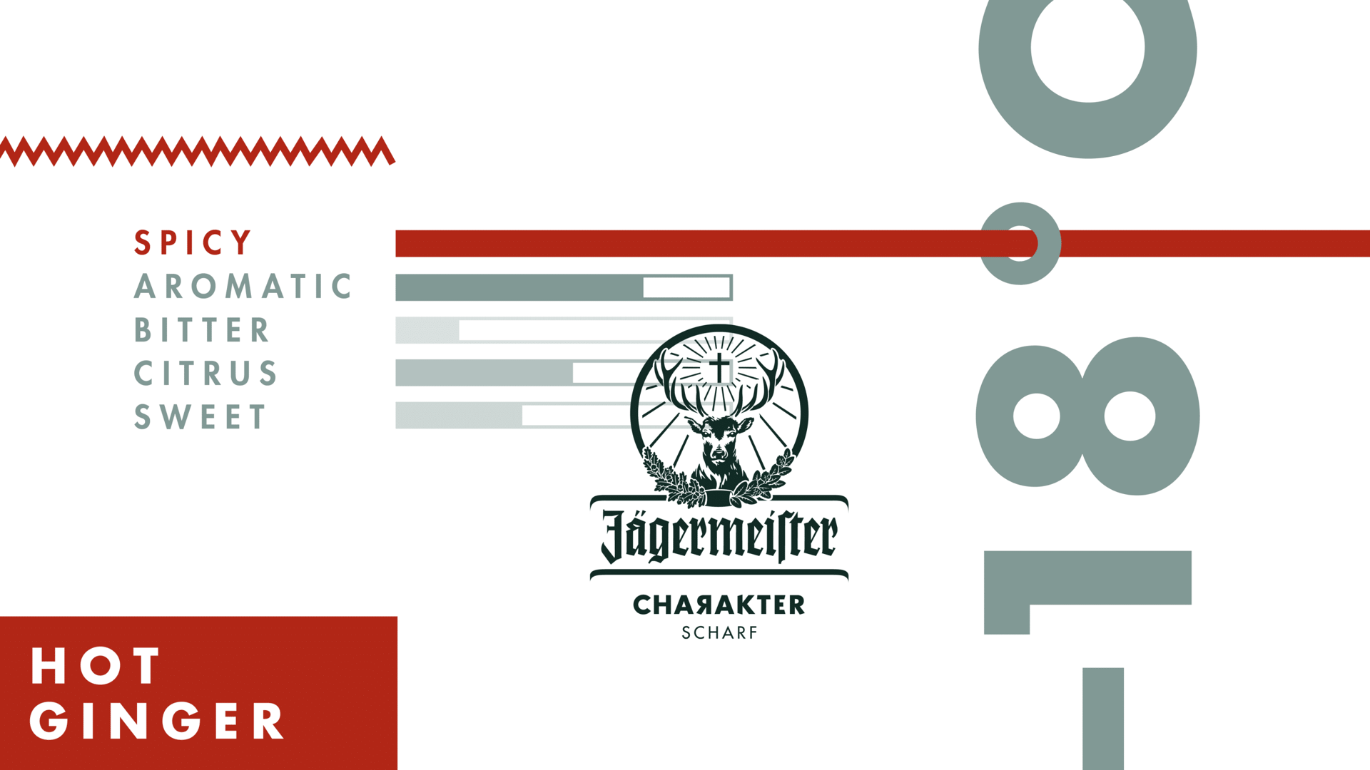
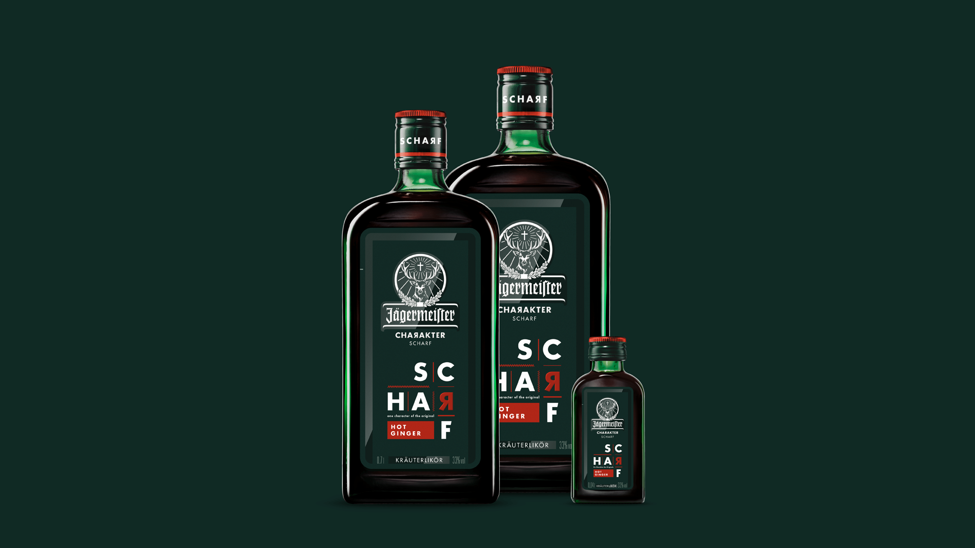
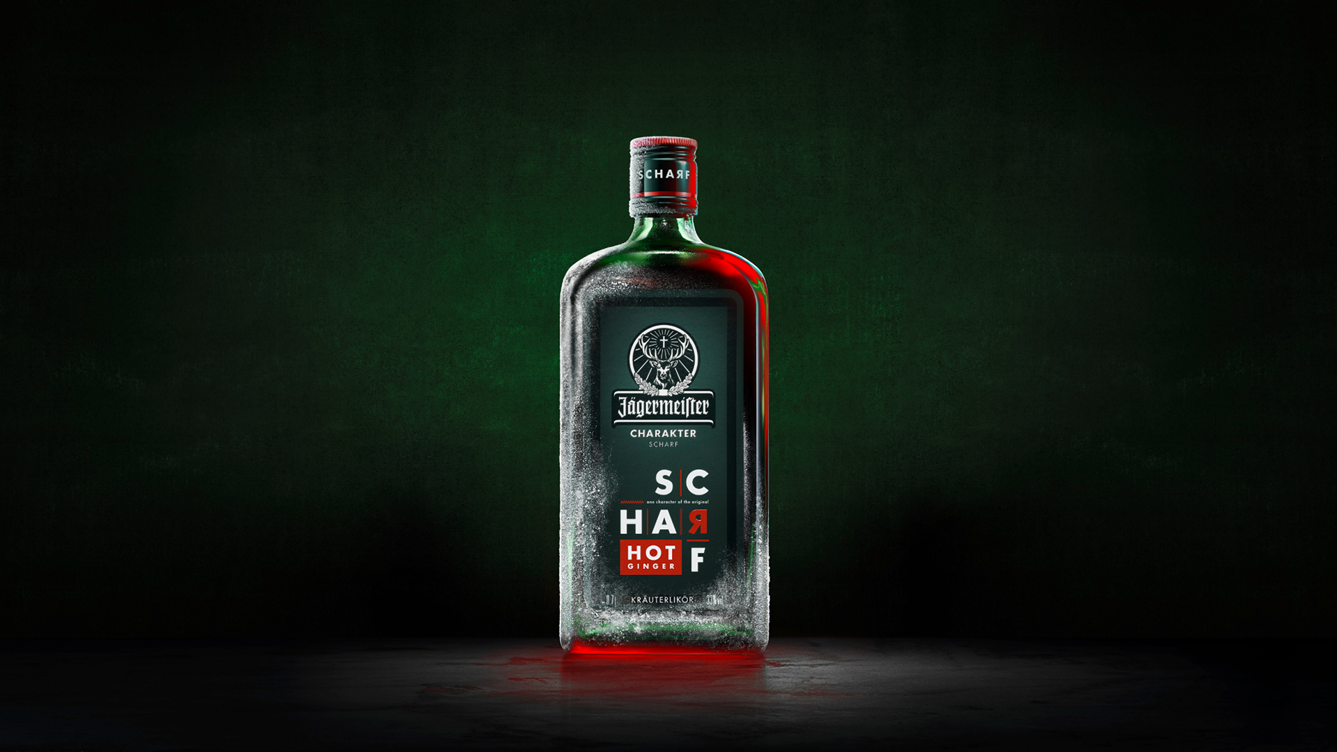
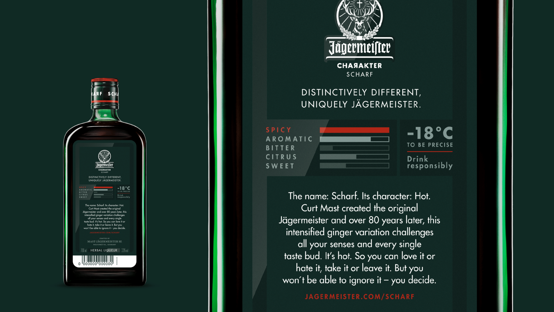
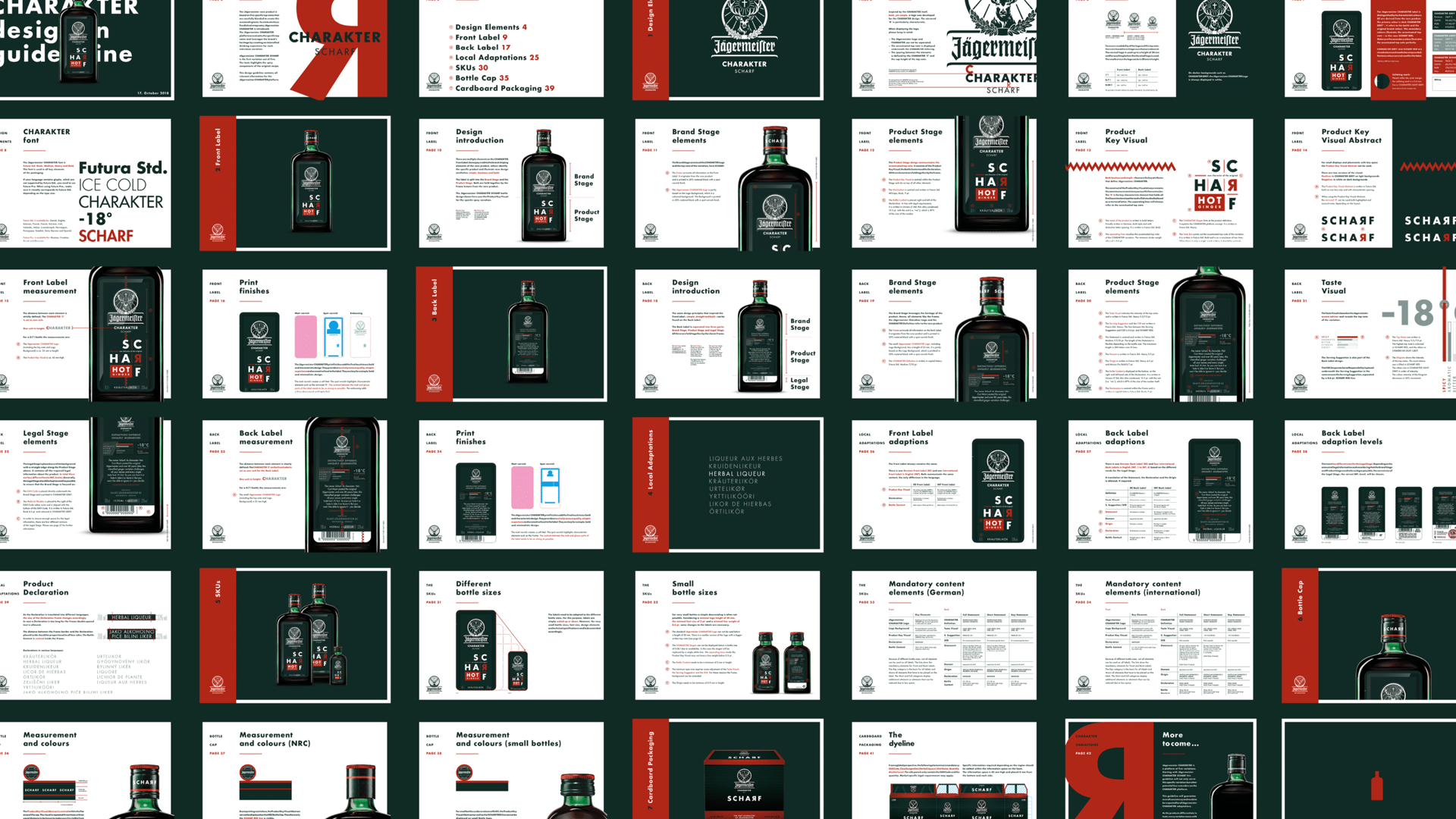
Jägermeister wants to appeal to new target groups while remaining authentic. The idea was also to intensify one of the five “top notes” of Jägermeister, namely the spicy flavour. We supported the brand with positioning, naming, design and packaging. Our common goal was to develop a design that is equally contemporary and unique, but still connected to the original. Accordingly, the front label is dominated by the word “SCHARF” which has been set in a rather unusual way. The type of design is said to borrow from the “expressive formal language of the Bauhaus.” On the back of the bottle, a legend shows all five top notes of Jägermeister. In first place is the dominant note “SCHARF”. The name “character” can also be found. The spelling is intended to emphasise the German origin of Jägermeister. However, the phonetic similarity to the English “character” is also intended. Despite all the innovative design ideas, the creative agency has not shaken one element of Jägermeister: The traditional stag retains its prominent place on the new product.

Client: Mast–Jägermeister SE
Agency: Brand Union Germany
My Role: Art Direction & Product Design
Year: 2017
OTHER PROJECTS